Portals: Interview With Imi Hwangbo
Huffington Post

Imi Hwangbo was born in Daegu, South Korea. She received her MFA from Stanford University, and has been a resident at Yaddo, the MacDowell Colony, the American Academy in Rome, and the Carmargo Foundation in France, among many others. She lives and works in Athens, Georgia, where she is Associate Professor at my alma mater, the University of Georgia. She currently has a show at Pavel Zoubok Gallery on West 26th street. The following is a portion of our exchange about pattern, abstraction and devotion to process.
For more about Imi’s current show, please visit Pavel Zoubok Gallery, NY.
The full interview will soon be available on Standard Means
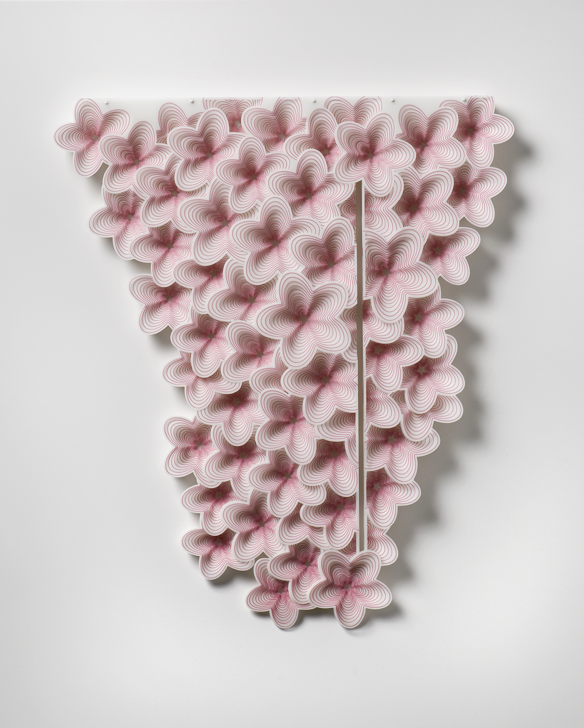
IH: I’ve always been attracted to the aesthetics of traditional Korean decorative art. Pojagi are functional, four-cornered cloths that are tied in bundles to carry domestic objects. As artworks, they are embroidered drawings on fabric. They are often decorated with patterns and imagery that convey Korean folk beliefs, with plants and animals that offer protection from harm, and express desires for wealth, longevity and fertility.
I wanted to work from these patterns, and stay faithful to the notion of a decorative object that is alluring to the eye and highly crafted over its entire surface. I also like the notion of decoration as a visualization of desire — as a gesture that covers a surface, repetitively and obsessively, with an iconography of desire.
RH: From what little research I’ve done, certain eras of Pojagi almost look like op-art and early modernist painting. Do you see your work as a means of subversion? Or is it more reverential?
IH: Pojagi patterns can have specific meanings within that particular cultural tradition. But at the same time, they can embody strategies that are recognizable in modernist painting. I like the notion of women artists in traditional Korea, inventing a modernist aesthetic with scraps of fabric. Their names are lost to history, so their identities can only be guessed through their inventiveness and craft. I’m drawn to the contradiction of that anonymity and the intimacy of the handwork. So perhaps you could consider it an homage.

IH: I trained as a sculptor, and art that combines image, object and materiality has always interested me. In the case of pojagi, I was intrigued by the creation of a line that was fabricated with thread and edges of fabric. It’s a line that you can see and feel. In the studio, I asked myself, what are the constructs by which we read a line and create legible space in a drawing? I started exploring different ways to make a line in a material way.
Another sculptural aspect is the creation of negative space within the pattern of the drawings. In some cases, I make clay models to visualize negative space. The paper is cut through with apertures that diminish in size with each layer, creating a perfect void by the final sheet. I’ve scaled the negative spaces to be attractive to the fingers, to enhance the tactile, physical quality.
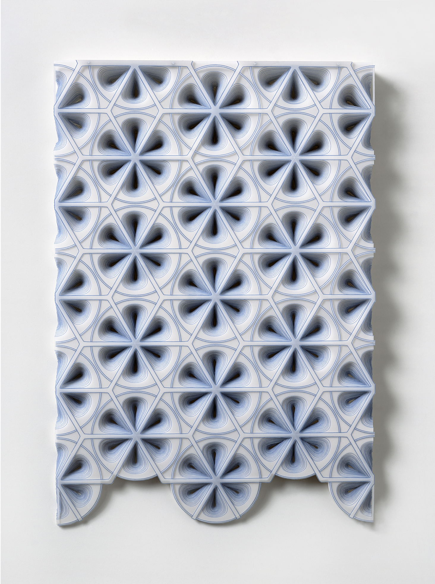
RH: Some works are based on the sacred ornamentation of the San Rufino Cathedral in Assisi. Do you see the role of pattern in serving a similar purpose in both subjects?
IH: For one thing, notions of infinity are implicit in repeating patterns. I was intrigued by how sacred ornamentation acts on the viewer in the cathedrals in Italy. Decoration, which can be considered innocuous and inessential, becomes purposeful and seductive in that situation. As artists, we’re accustomed to the process of using visual pleasure and the promise of transformation to seduce the viewer. The trust that is engendered by the art object, to persuade someone to go on that journey, is fascinating to me.
RH: So how did the Assisi Frescoes inform your work, specifically?
IH: That cathedral stands out to me because of its heightened, painterly inventiveness. I spent an hour drawing an especially complex pattern, right behind St. Francis’ head. I reconfigured the pattern, and developed designs in which elements of the pattern appear and disappear as if eroded by time. Each drawing is made with six layers of intricately cut mylar, with lines that are drawn in space and cast a delicate shadow. I incorporated color schemes from Renaissance painting, with blues and greens of landscape painting contrasted with peaches and pinks of the figure. To me, the luminous color and transparency recall the effect of stained glass.
IH: Your question reminds me of “Diviner,” a large commission for the Peninsula Hotel in Hong Kong. The Chinese were great clients. They had one stipulation: The piece had to be red. So color was one form of content in the piece.
Right before I worked on it, my family spent some time at our house in the mountains of Sonoma County. Up there, it’s possible to look at intense starry skies, undimmed by artificial light. It made me think about how random scatterings spark the unconscious mind, and bring to the surface intuitive insights that exist below our conscious reckoning.
I like to think that my work is centered in the space between the viewer and the artwork. The viewer becomes the diviner, guided by intuition towards insight by patterns formed by chance.
RH: Can you talk a bit about how they are made? How they originate and then become actualized?
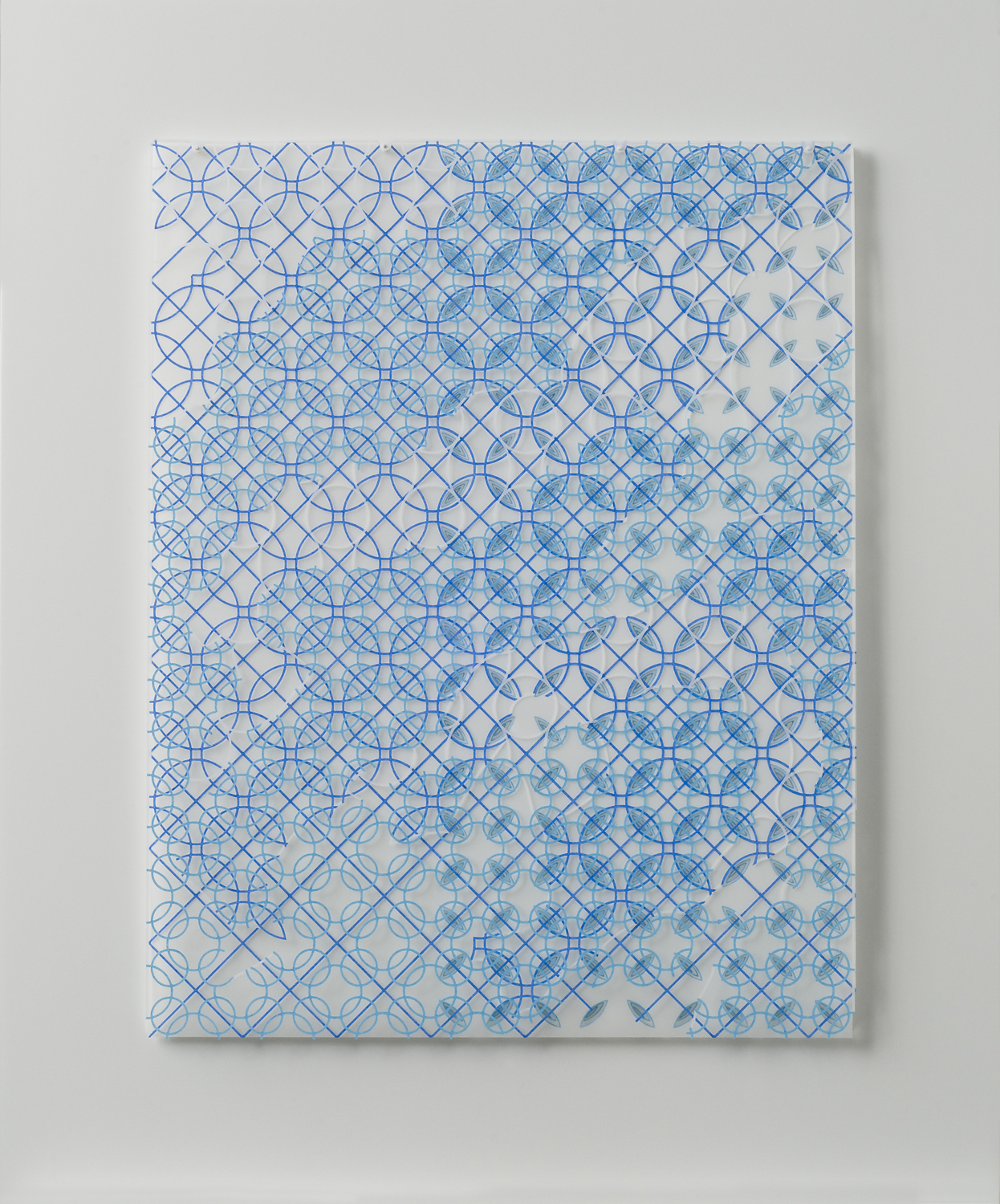
IH: I physically sculpt a drawing with paper that is ripped, cut, torn, and taped. I design for scale with paper models that explore how the piece relates to the body and its context in architecture. These drawings are then refined and made denser on the computer. The artworks based on pojagi patterns are quite dense, usually between seventeen to thirty layers of handcut mylar. The drawings in my new show, “Portals” are six layers of mylar that are held apart at a precise distance to create optical effects.
Chance, both cultivated and accidental, plays a role in my process. It helps to continually reframe the questions that are being asked. When designing new pieces, I may cut out flowers or whatever unit is in use, scatter them onto the table and see how they fall. If the pattern seems to be working, I pin them to the table.
IH: We had a joke at Yaddo that you don’t want to go to studio and find a note from the muse: “I was here. Where were you?” Labor is a way for me to be present in the studio and wait for the muse to visit. There are those great moments when the aspect of being in a dynamic relationship with the work becomes apparent.
One of my most labor intensive pieces is a large piece, called “Lepidoptera,” which took an entire summer to make. The design was based on the carved doors of a Buddhist temple in Korea. The word “lepidoptera” is a category in taxonomy that includes the order of moths and butterflies. Vladimir Nabokov, who was a lepidopterist, considered the butterfly to embody an innocence and beauty that can only be obtained by destroying it.
In this piece, I referenced the moment of standing before a threshold, and choosing whether to enter. This piece was challenging because there were aspects that were beyond my ability to change. The paper came off a roll, so the piece has a subtle curve to it. I realized that the curve of paper gave the piece a sense of breath and life. It was great to learn from the artwork, have it sculpt me a little bit.
RH: What about the importance of precision? Beyond just looking great, there seems to be more substantial purpose, both visually and psychologically.
IH: One of my pieces, “Portal” took quite a bit of engineering. As you know, I teach at the University of Georgia, and there is a fabrication shop on campus that fabricates instruments for scientists. They helped me build a hanger for this long vertical piece which consists of three layers of mylar that are cut out to such an extent that they become a lattice. The layers are held apart on grooved pins, so you can imagine how much precision was required. When viewed frontally, it creates an optical illusion of the kind of space you described, one that is both shallow and has vast depth.
I think it’s essential to the piece that there are no moments of imprecision. The viewer is engaged in the suspension of disbelief, seeing deep space where none actually exists. A lack of precision would ruin the magic trick.

IH: I’ve noticed that viewers like to get extremely close to my work. It has been described as “sculptural op art,” and there is a natural desire to see how it works. It seems so simple and transparent, but that is one of the hardest tricks in the book! And the sense of scale, how the piece relates to the body, is important to experience in person. That certainly gets lost in a photograph.
My current show at Pavel Zoubok coincides with shows by Stephen Sollins and Maritta Tapanainen. Stephen’s work combines paper correspondence and American quilt patterns, and Maritta’s collages contain mirror images that are duplicated by hand. There’s a wonderful dialogue between the shows about art and craft, technology and a stubborn attachment to the handwritten and handmade.